THE PROJECT
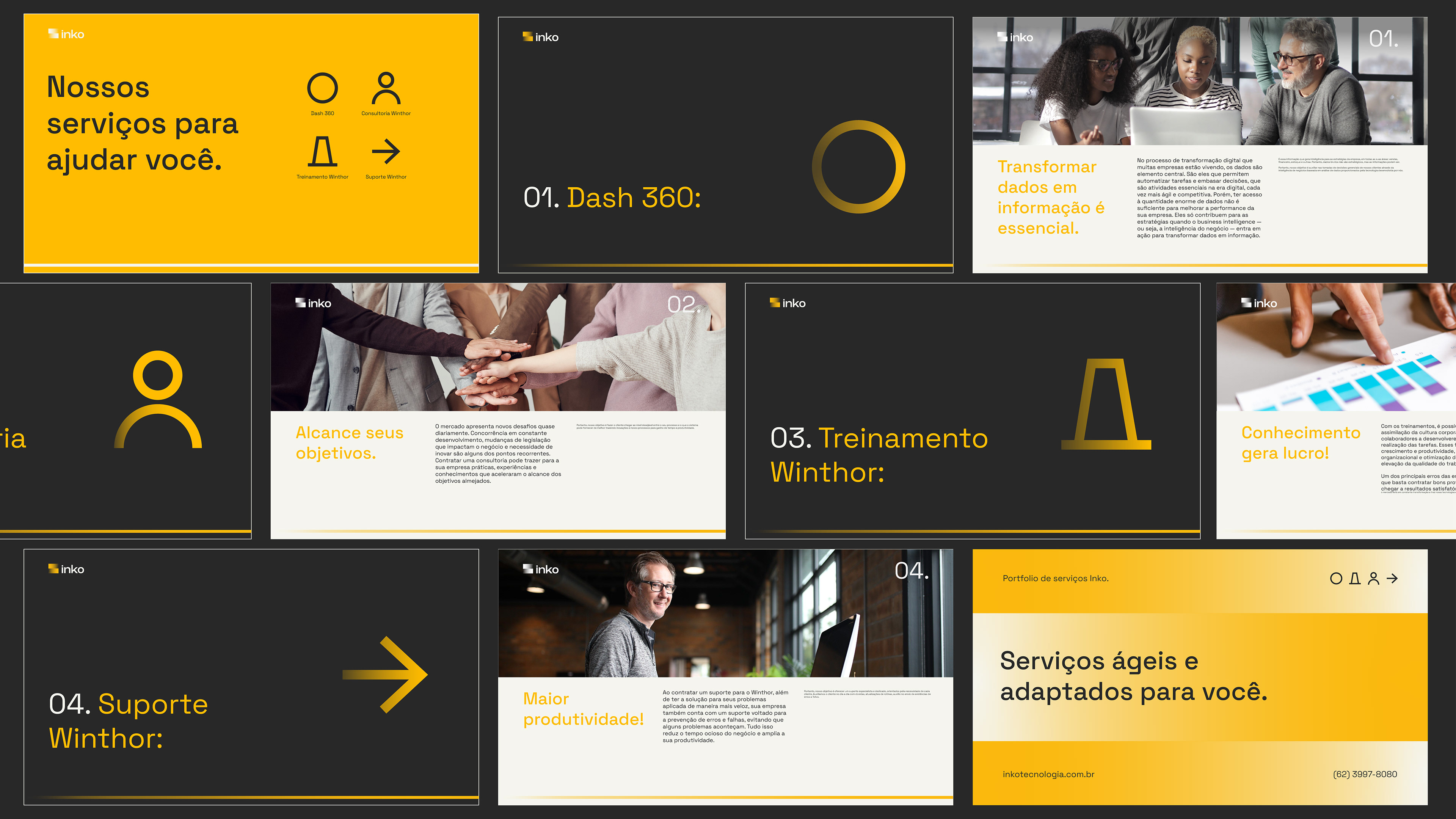
Inko is a company that provides services in the area of technology implementation and information systems in businesses through training, lectures, and workshops, following four working platforms: Dash 360, Winthor Consultancy, Winthor Training, and Winthor Support. The institution emerges from Data Unique Tecnologia, a company seeking to create a new approach that delivers continuous service to its clients.
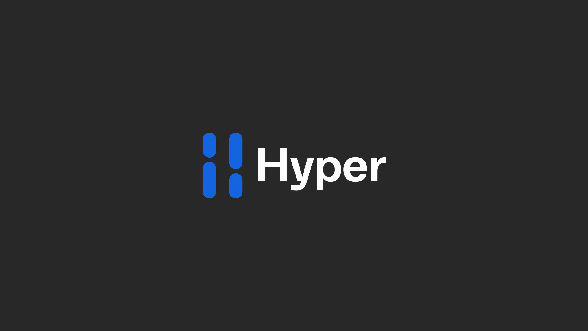
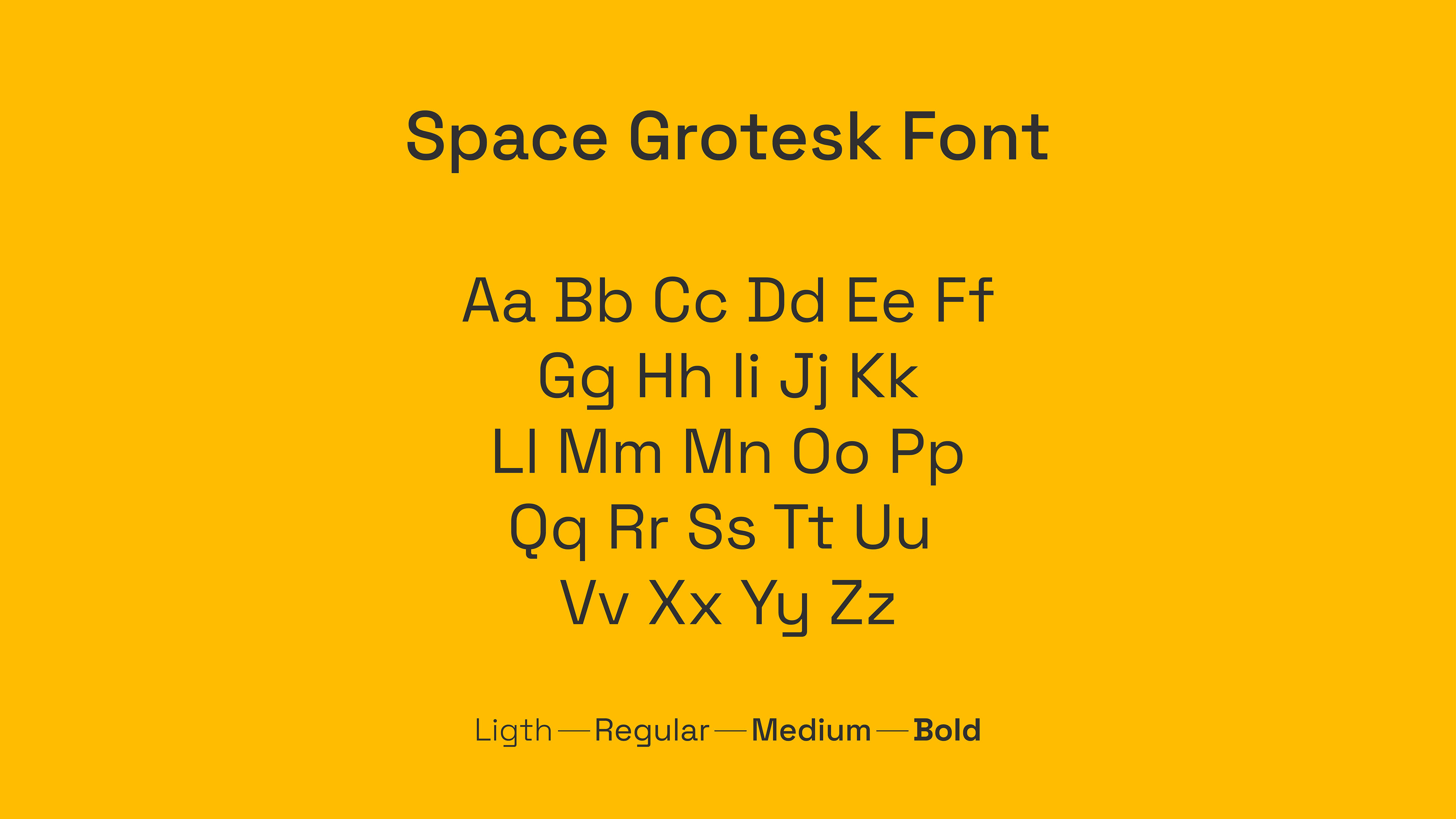
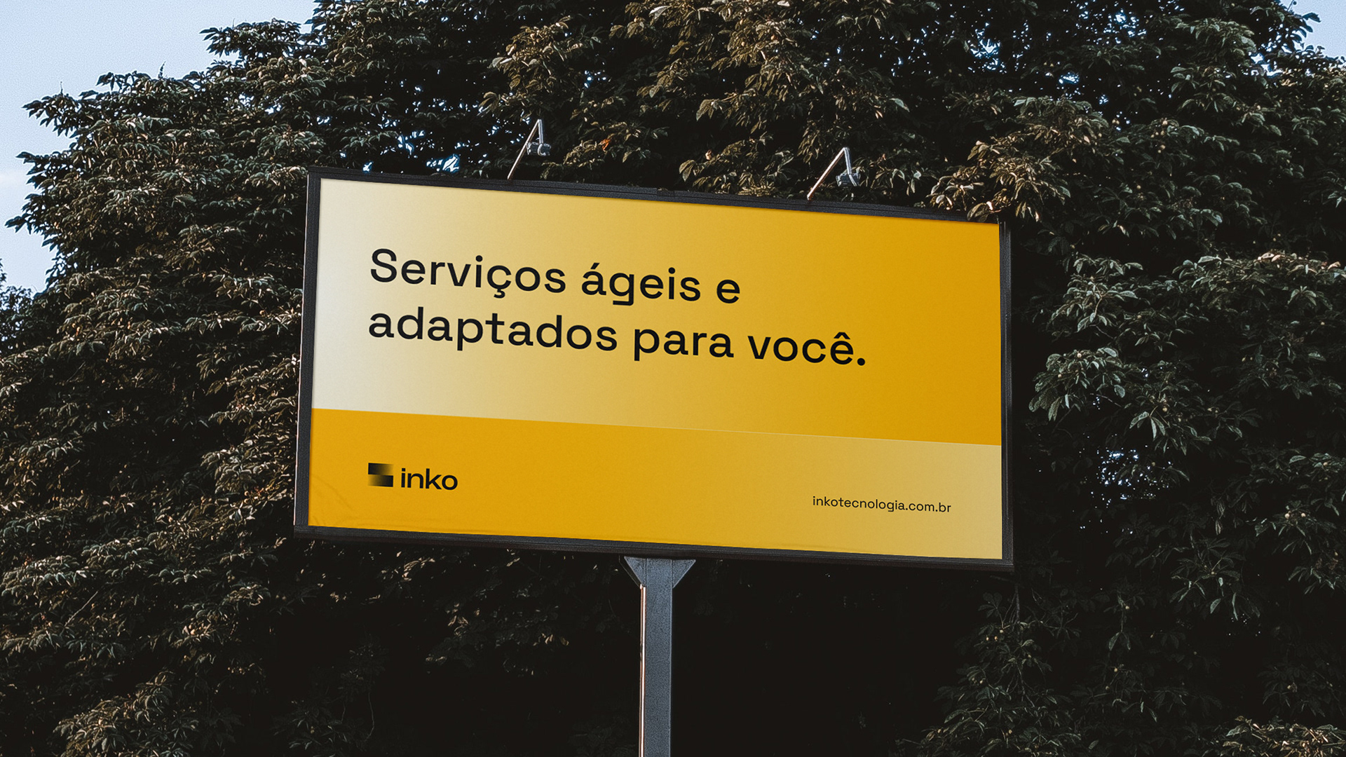
The challenge was to convey a communication that speaks to leaders and technology teams of companies about a highly agile and extremely efficient service, combined with the values and attributes of: Work, Merit, Technology, and Teamwork. In this project, we aimed to showcase the maximum technological and innovative characteristics of the brand through typography.
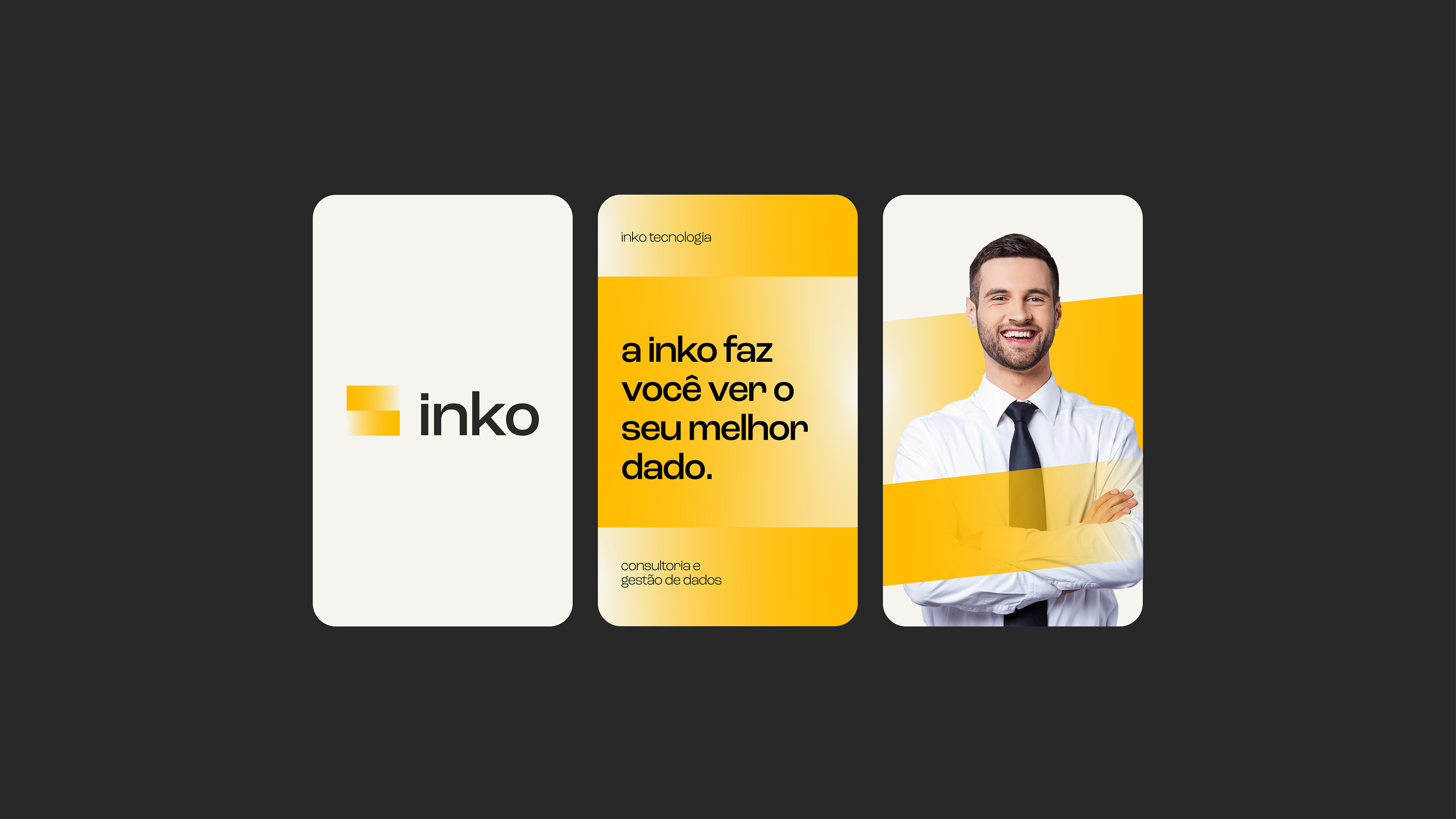
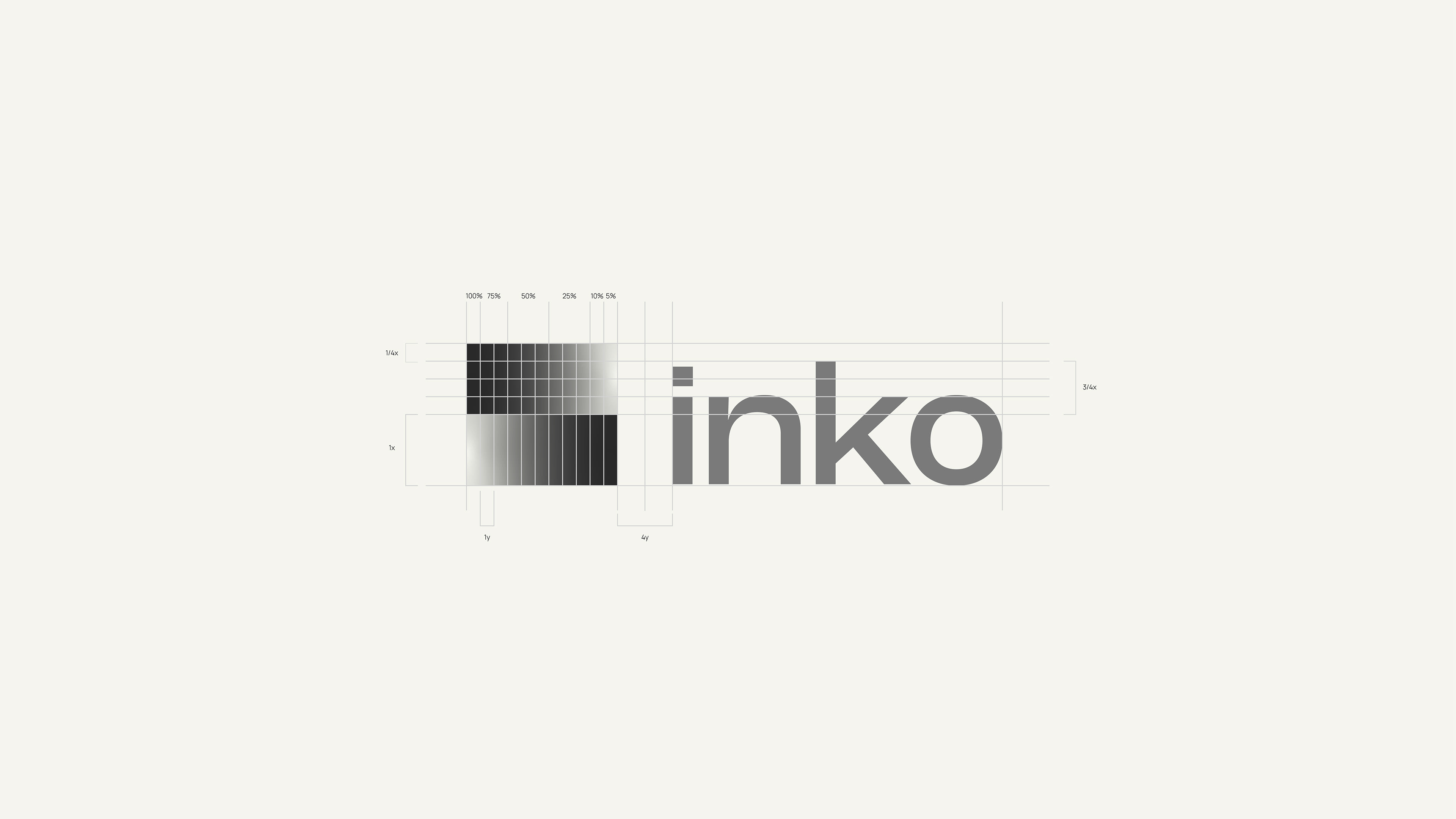
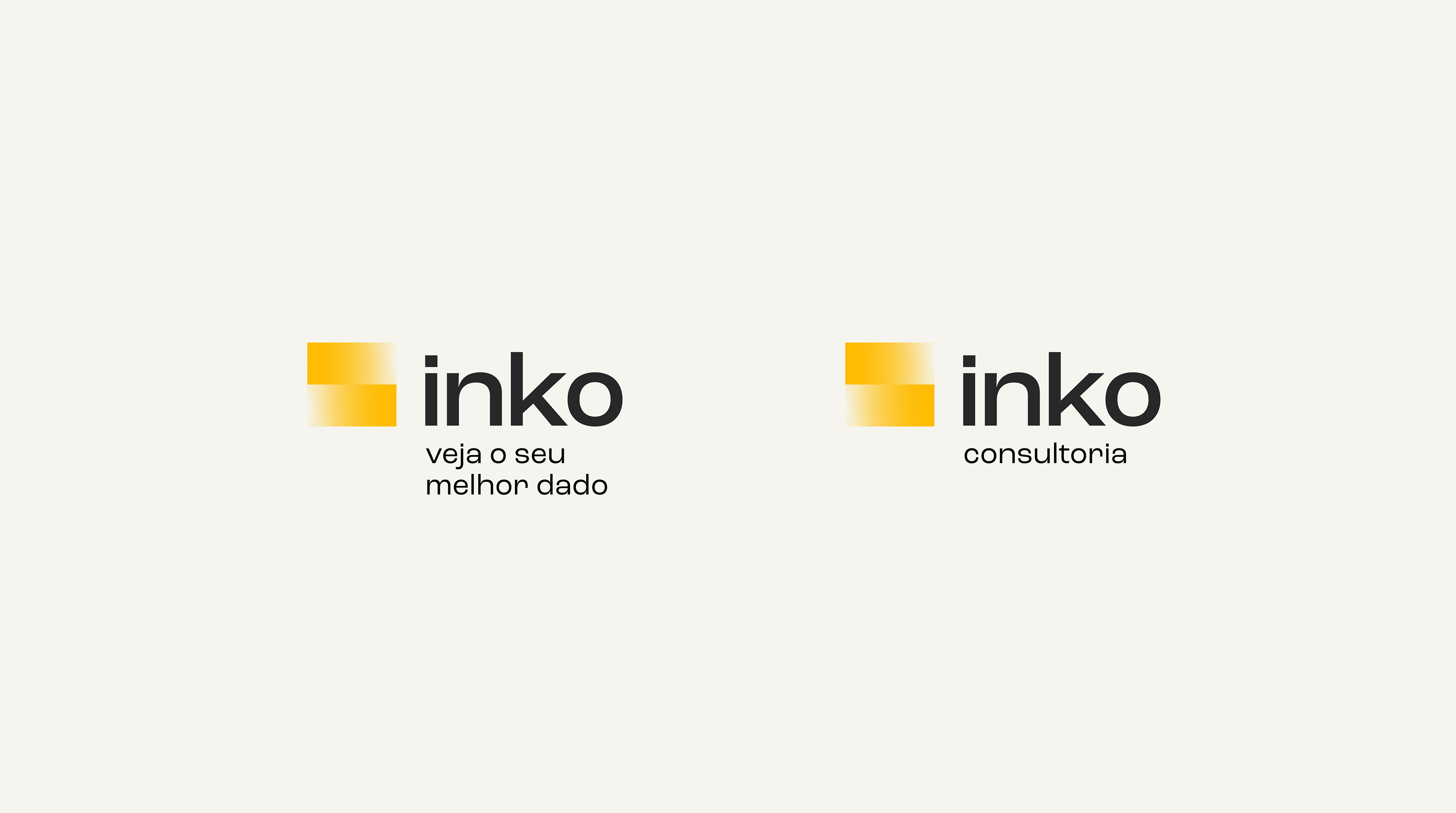
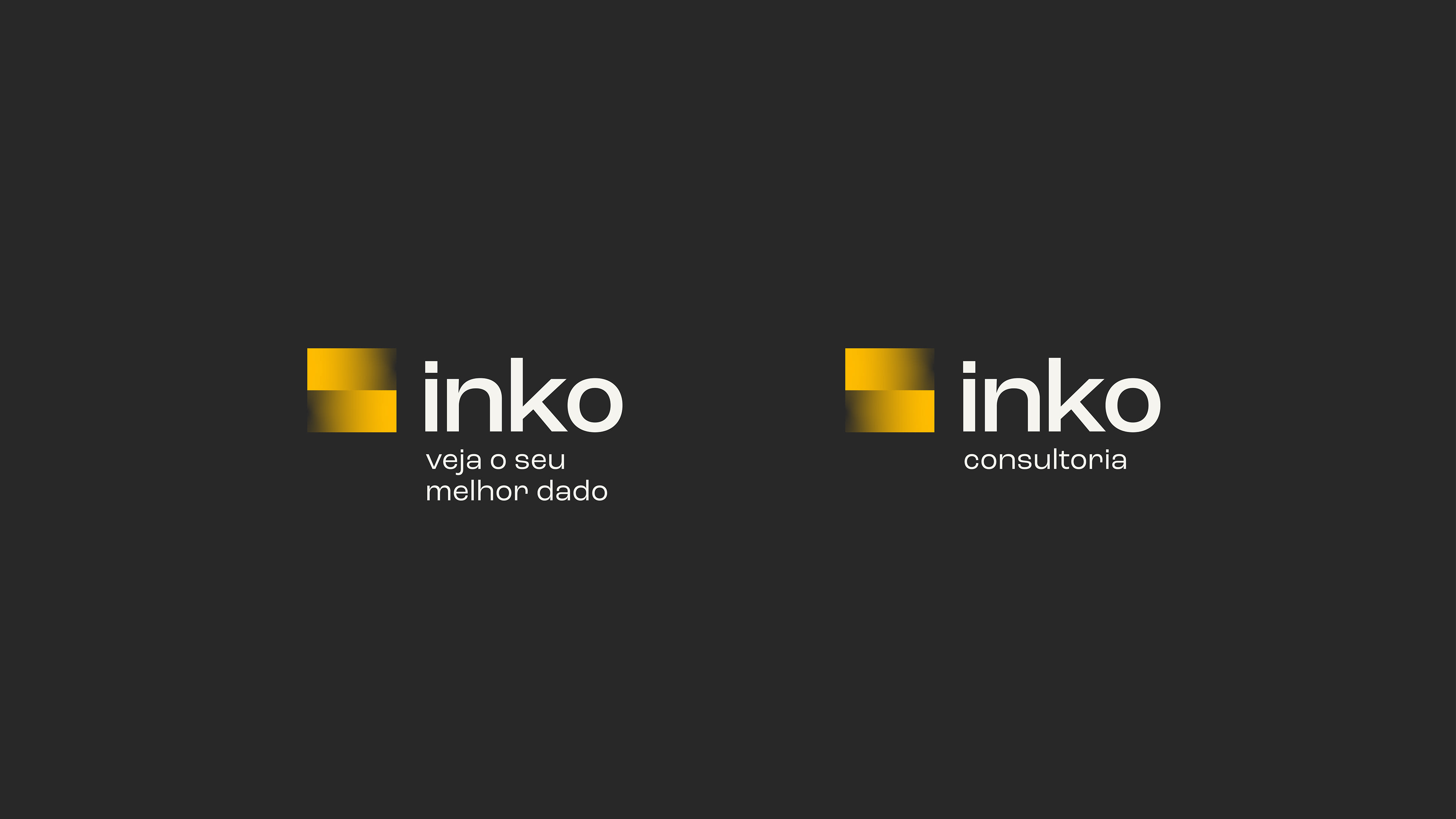
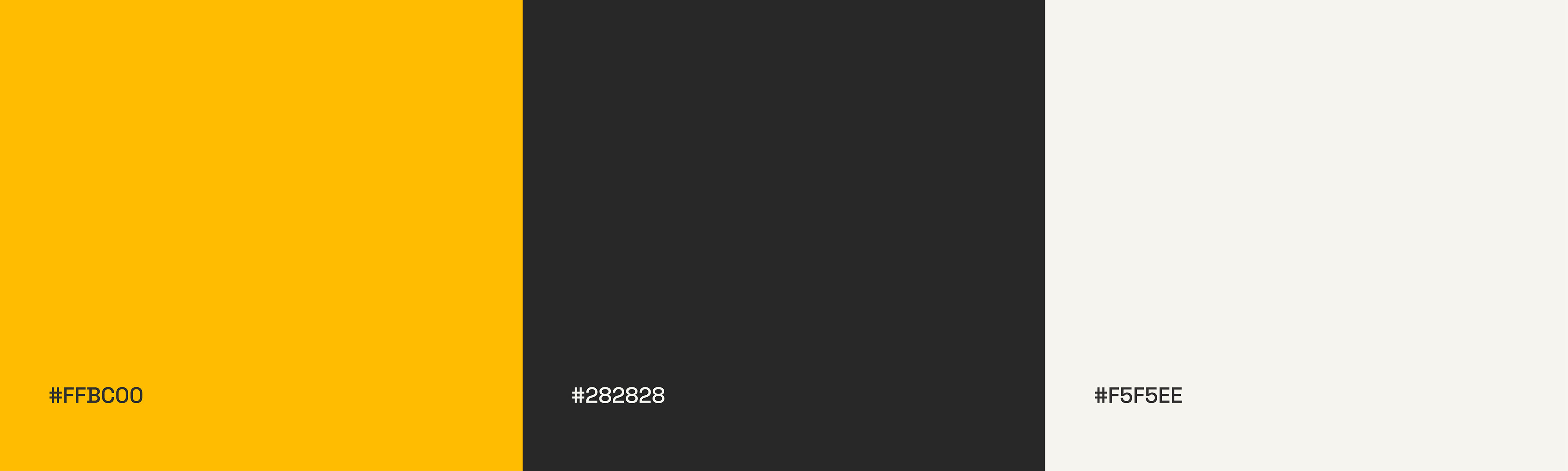
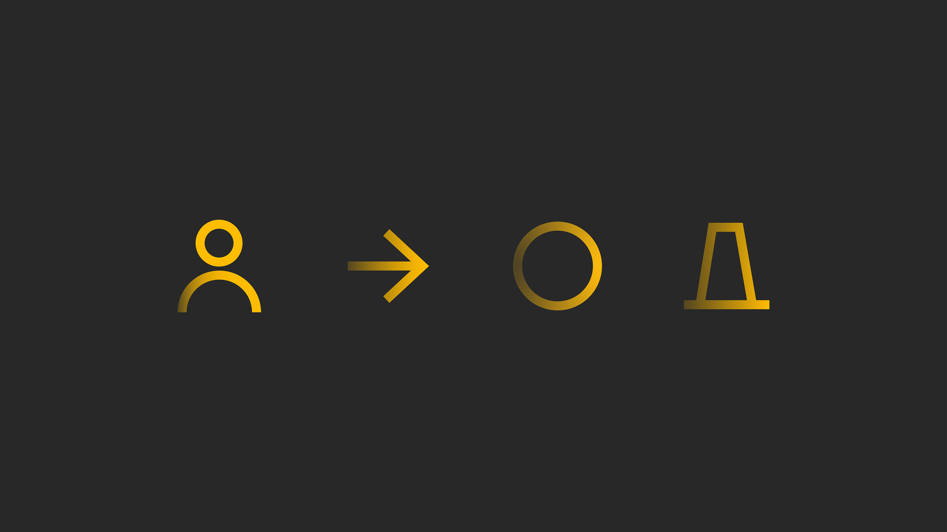
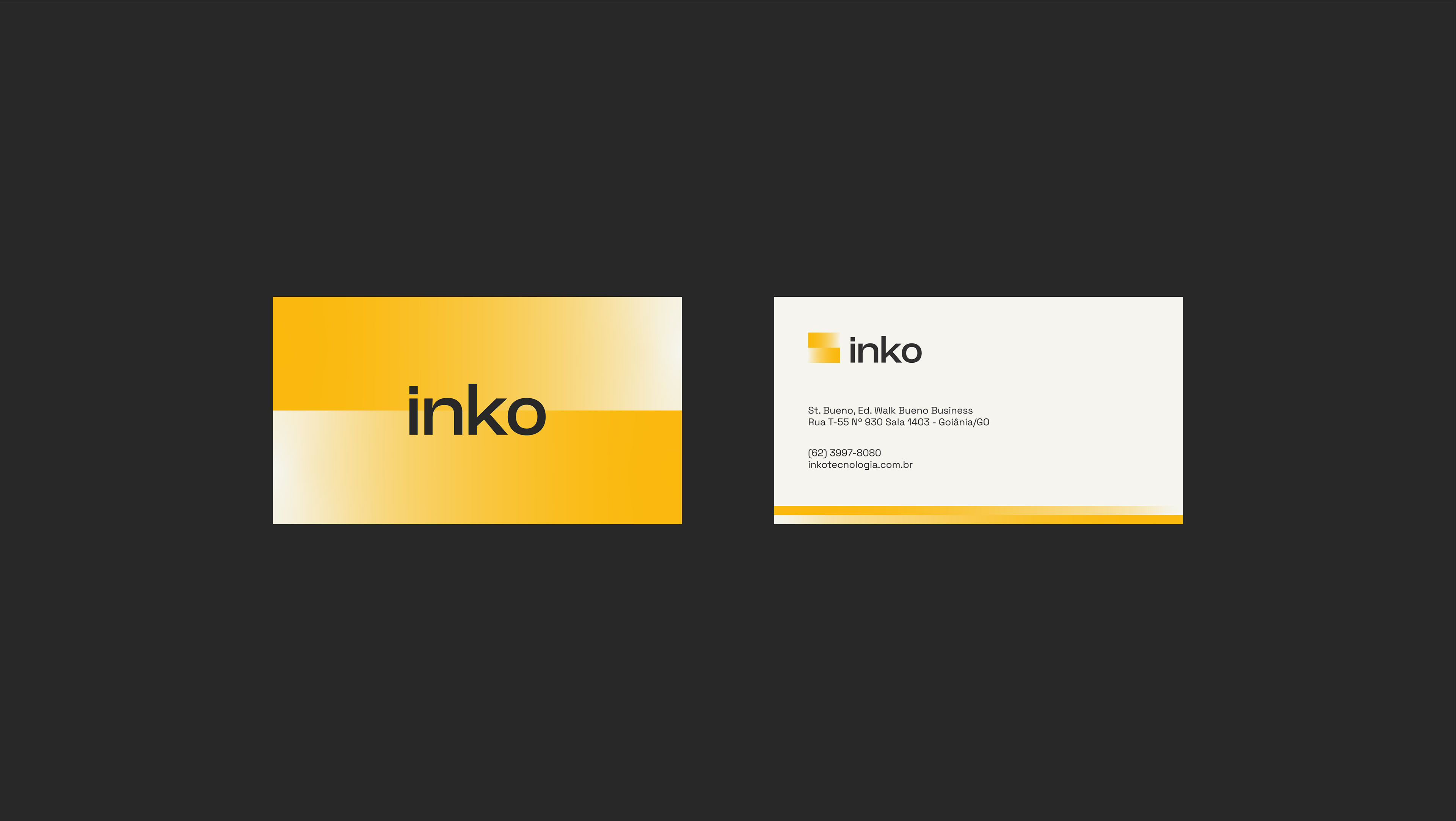
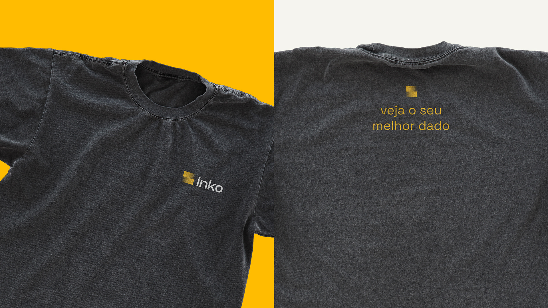
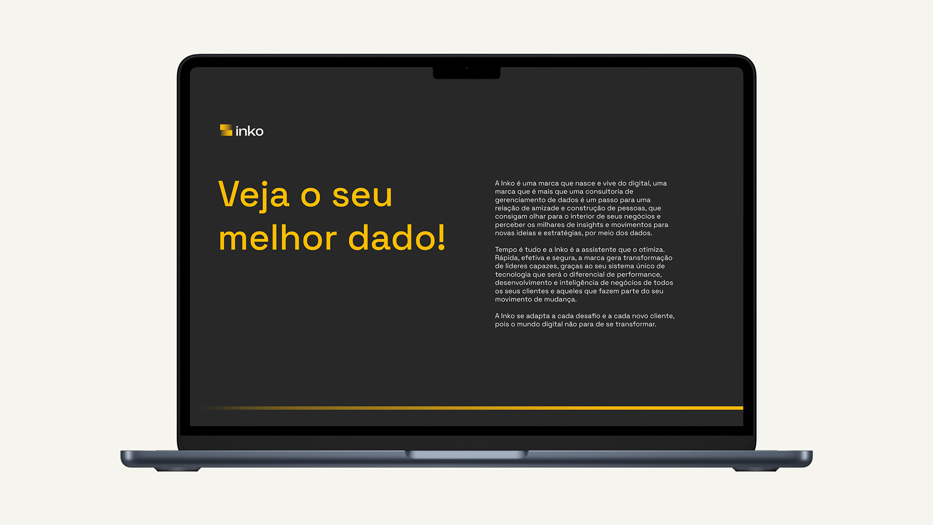
We designed a minimalist symbol with strong traits of expansion, agility, and analysis. The colors consist of vibrant contrasts, led by the energetic and fast-paced yellow of the brand. The brand's verbal identity reinforces its positioning through the tagline: "See your best data!" Where we convey the entire idea and present it in a set of 5 easily understandable words.
PT/BR
Inko é uma empresa que presta serviços na área de implementação de tecnologias e sistemas da informação em empresas por meio de treinamentos, palestras e workshops, seguindo quatro plataformas de trabalhos: a Dash 360, a Consultoria Winthor, Treinamento Winthor e Suporte Winthor. A instituição nasce a partir da empresa Data Unique Tecnologia, que busca criar uma nova vertente que preste um serviço contínuo ao seu.
O desafio era traduzir uma comunicação que falasse com líderes e times de tecnologia de empresas de um serviço muito ágil e de extrema eficiência combinados aos valores e atributos de: Trabalho, Mérito, Tecnológico e Teamwork.
Buscamos neste projeto por meio da tipografia exibir os máximo de características tecnológicas e inovadoras da marca. Criamos um símbolo minimalista e com fortes características de expansão, agilidade e análise. As cores são contrastes bem vivos lideradas pelo amarelo enérgico e veloz da marca.
A identidade verbal da marca reforça seu posicionamento a partir da tagline: "Veja o seu melhor dado!" Onde transportamos toda sua ideia e a apresentamos em um conjunto de 5 palavras de fácil entendimento.
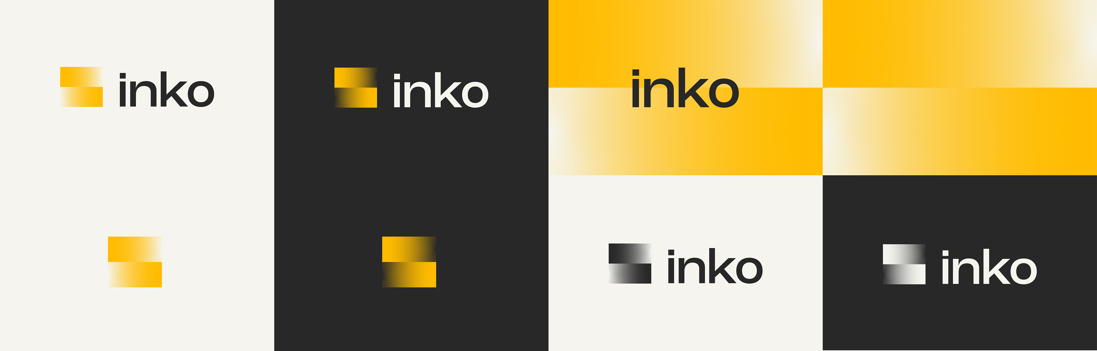
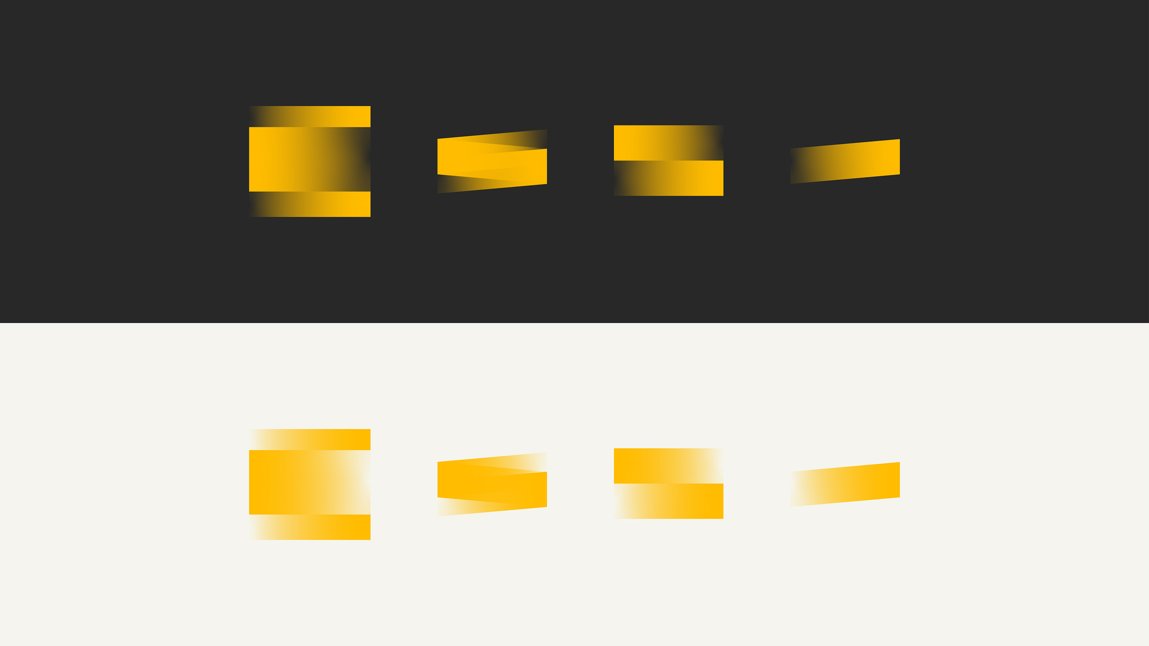
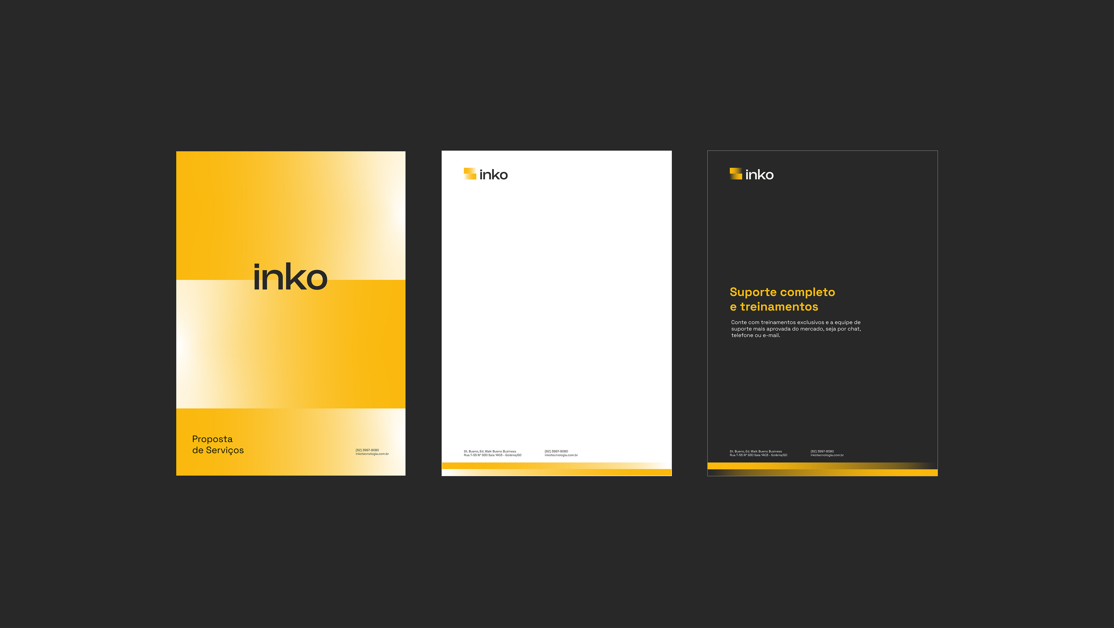
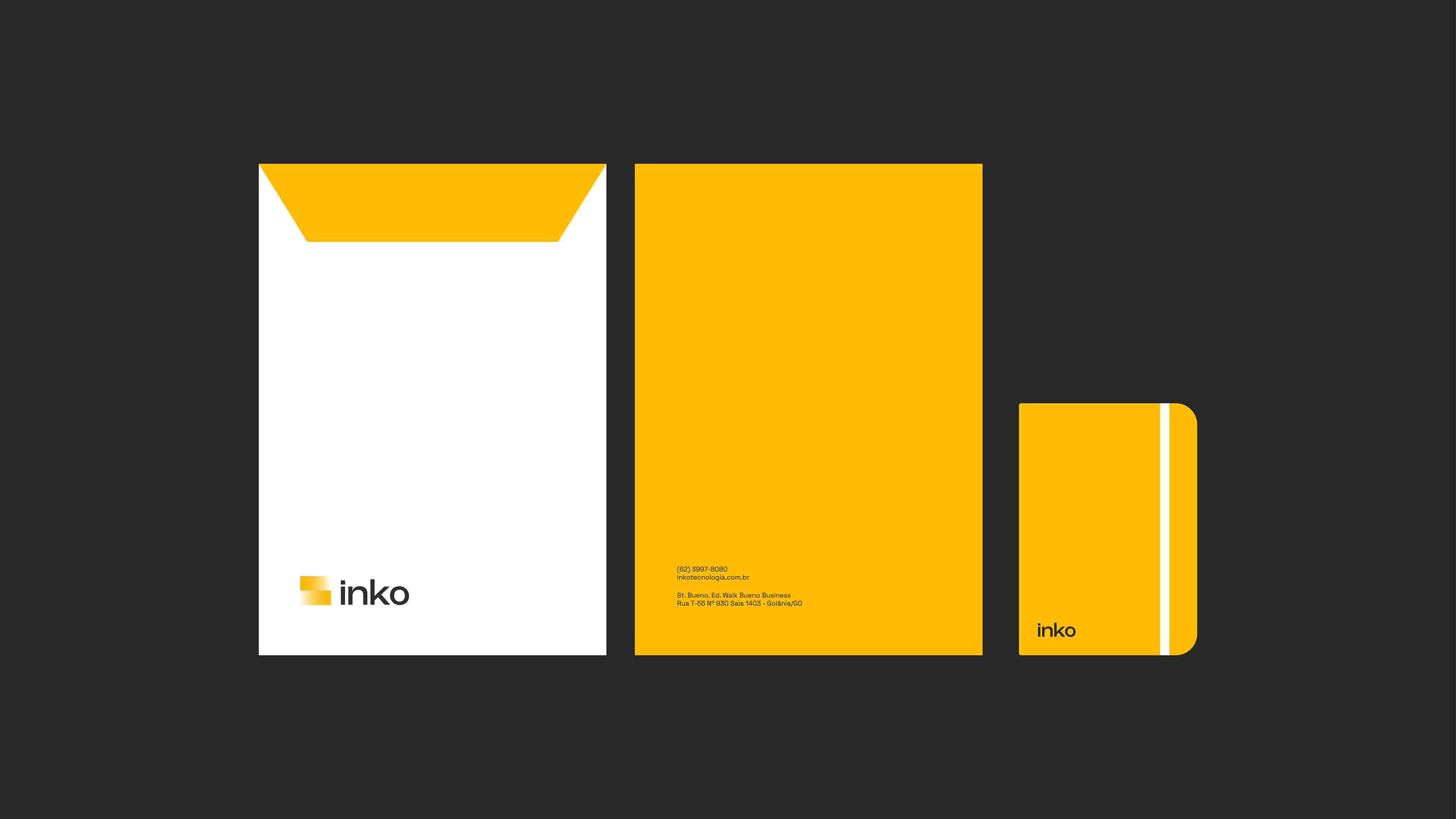
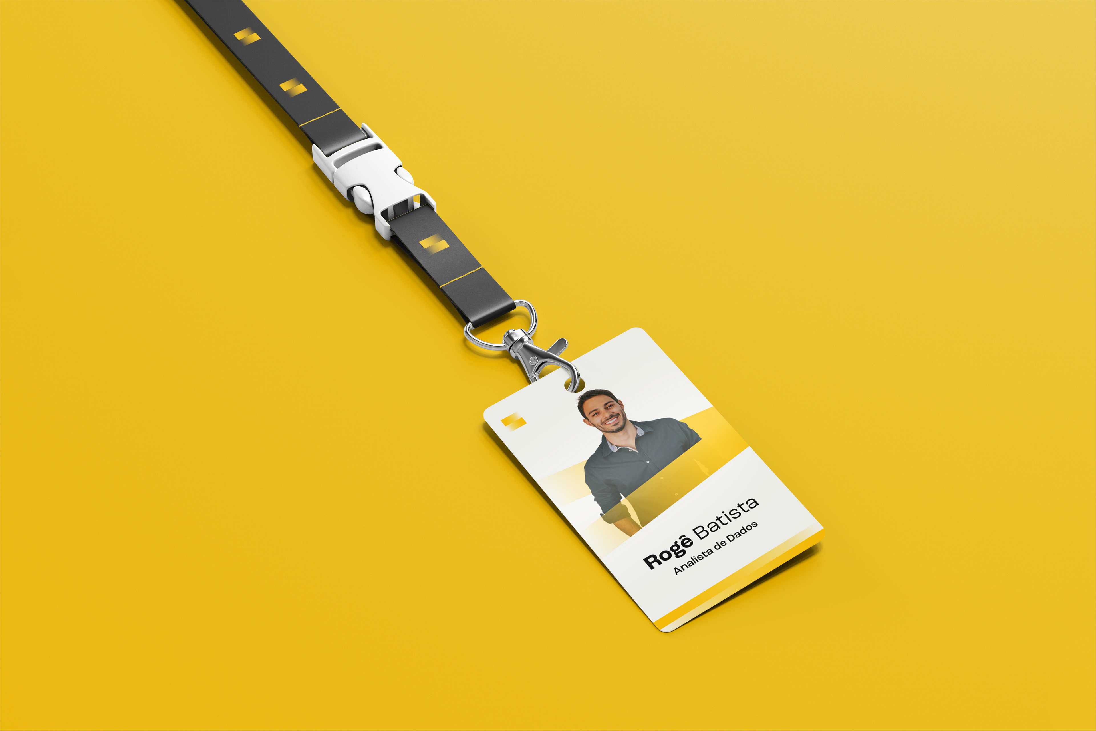
The entire visual identity was built upon the characteristics of the symbol, allowing us to create various forms of brand expression and graphics based on it. The brand's stripes expand and adapt into different shapes and movements, bringing life to a rich and authentic visual universe throughout the brand's environment.
PT/BR
Toda identidade visual foi construída em cima das características do símbolo, assim a partir dele podemos criar diversas formas de expressão da marca e de seus grafismos. As faixas da marca se expandem e adaptam em formas e movimentos dando vida a um rico e autêntico universo visual em todo o ambiente da marca.
INKO
Services developed:
Naming, Brand Identity, and Graphic Materials